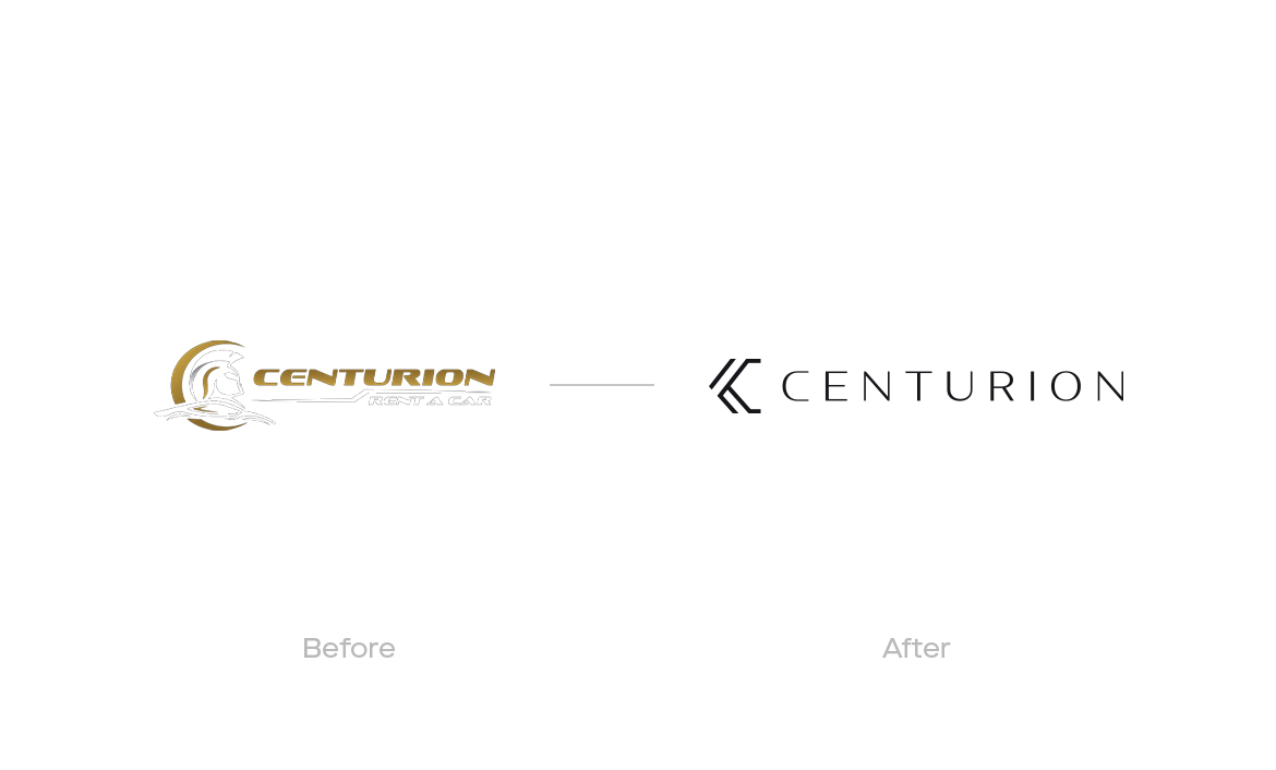
Centurion’s original logo consisted of a symbol, based on a Roman commander's helmet. Opting for a symbol that would stay evergreen and remain relevant in the upcoming years, the founders of Centurion considered it would be better to work on something new. They wanted a symbol that presented opportunities for further experimentation and growth, while simultaneously keeping its luxury flare intact.
CENTURION
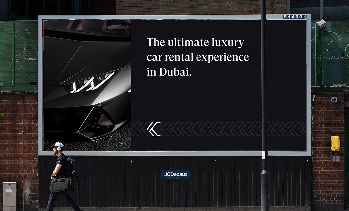
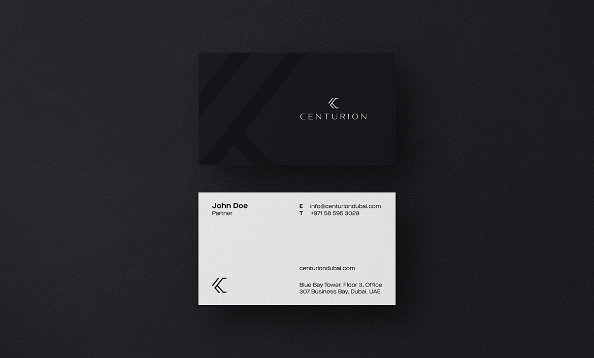
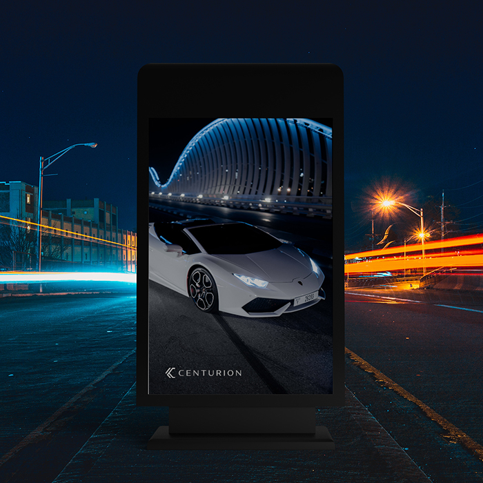
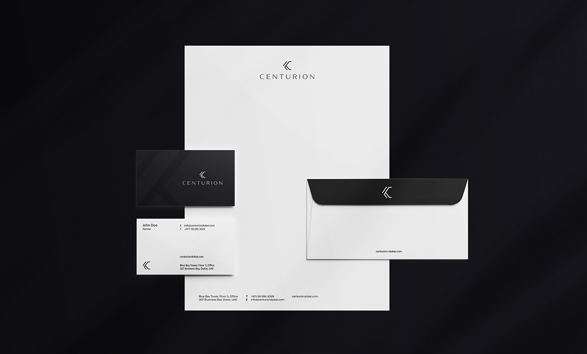
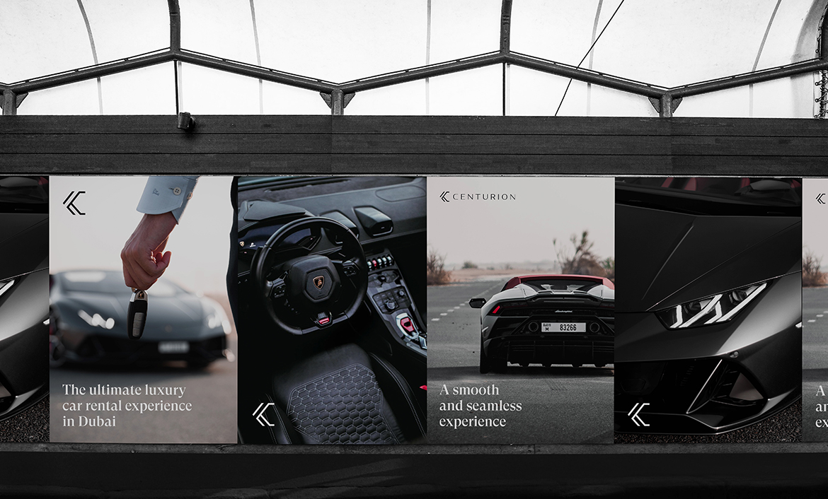
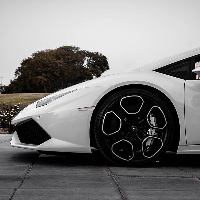
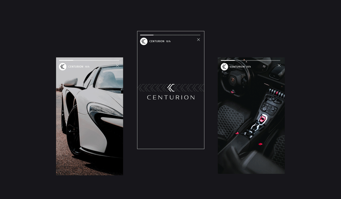
In 2021, I worked with Centurion, a luxury car rental brand based in Dubai, UAE. The founders approached me with the aim of creating an identity that complemented their premium fleet of exotic and luxury cars. It was an exciting venture, as I had the opportunity to showcase creativity in the automotive domain, especially since I could go with sophistication to reference the lavishness of their cars.
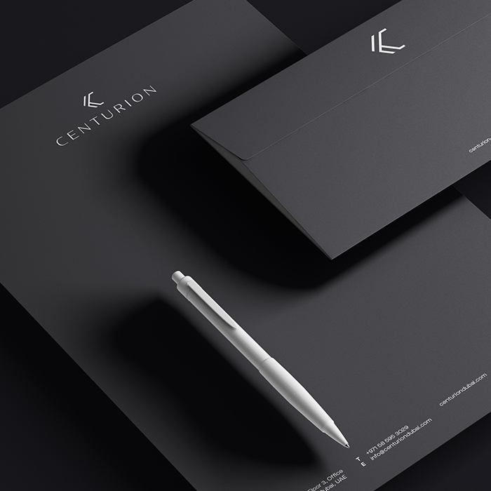
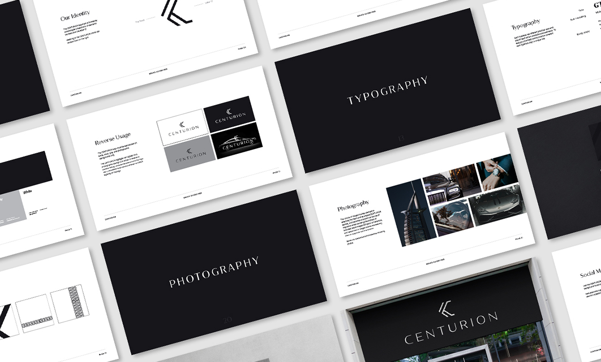
I had to ensure that the sophistication I wanted to exhibit in my designs played out well on all platforms, from brand stationery to website and much more.
- client CENTURION
- year 2021
- disciplines Art Direction, Branding
Before and After
Symbol Development
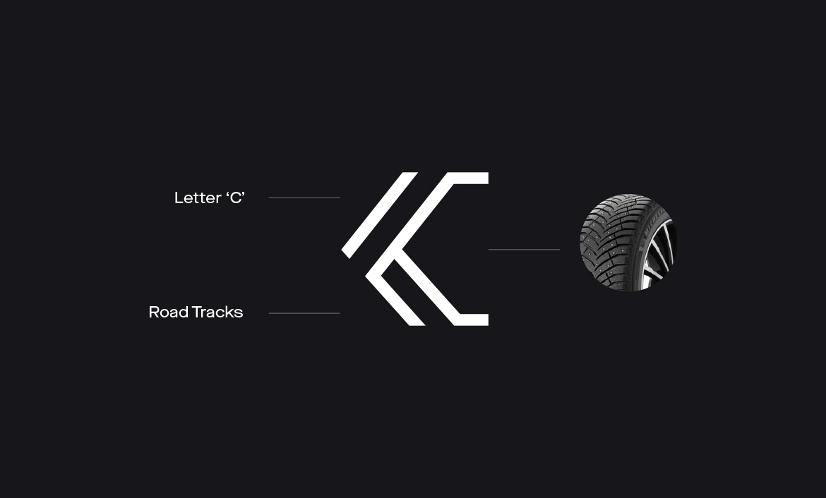
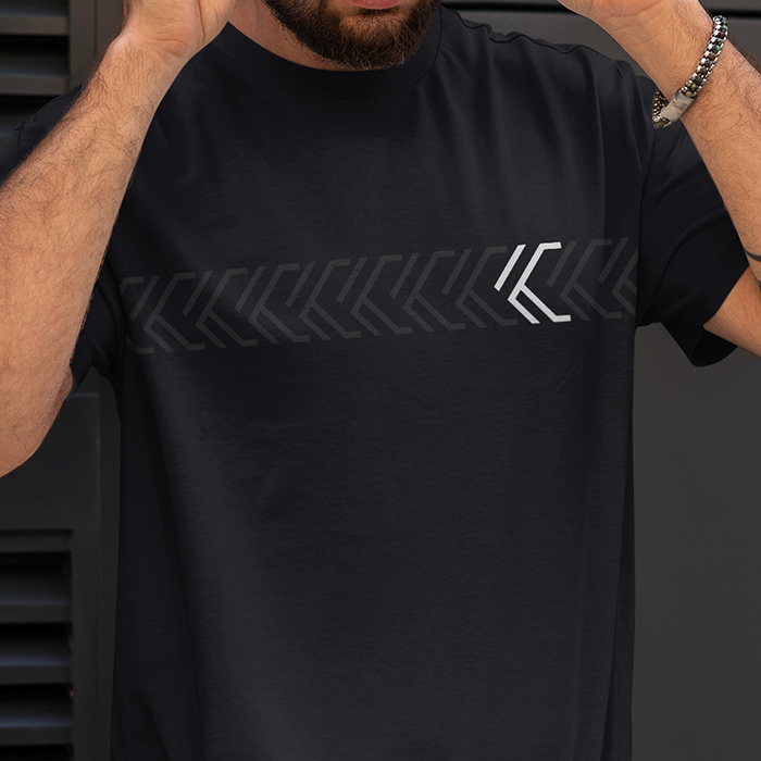
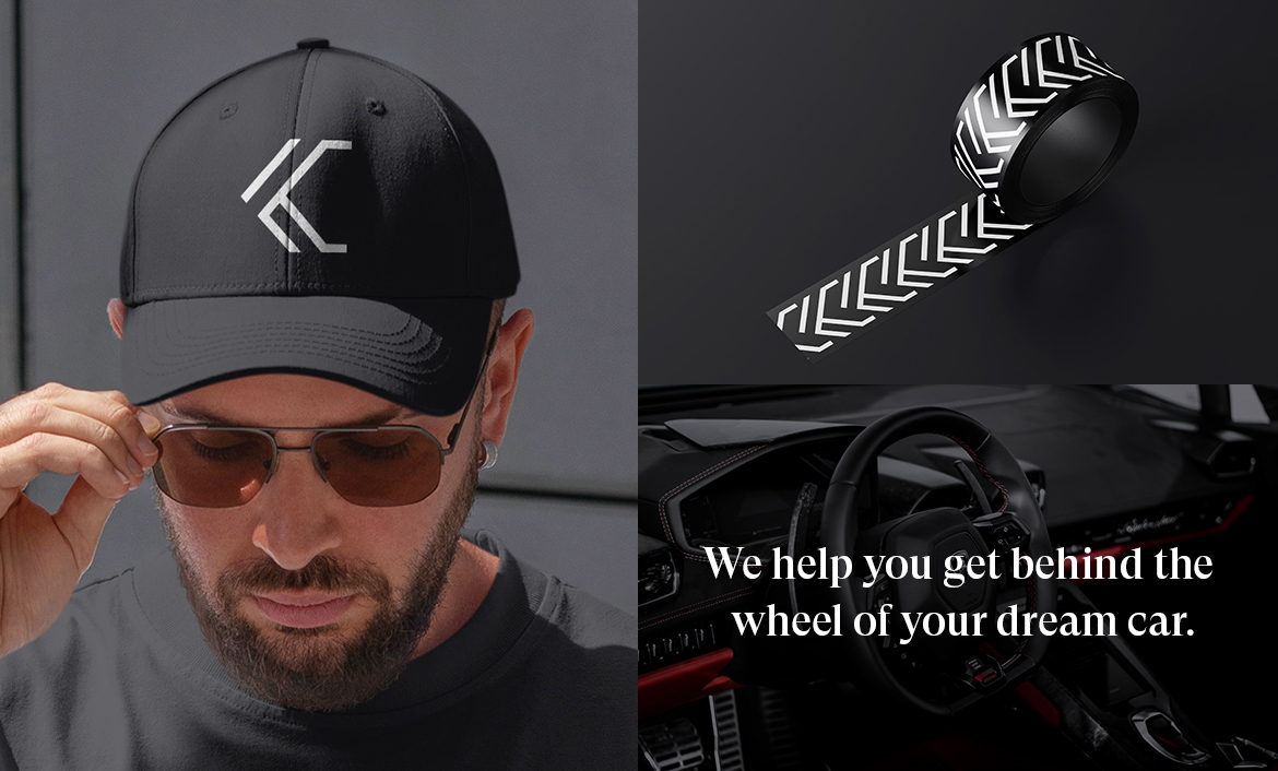
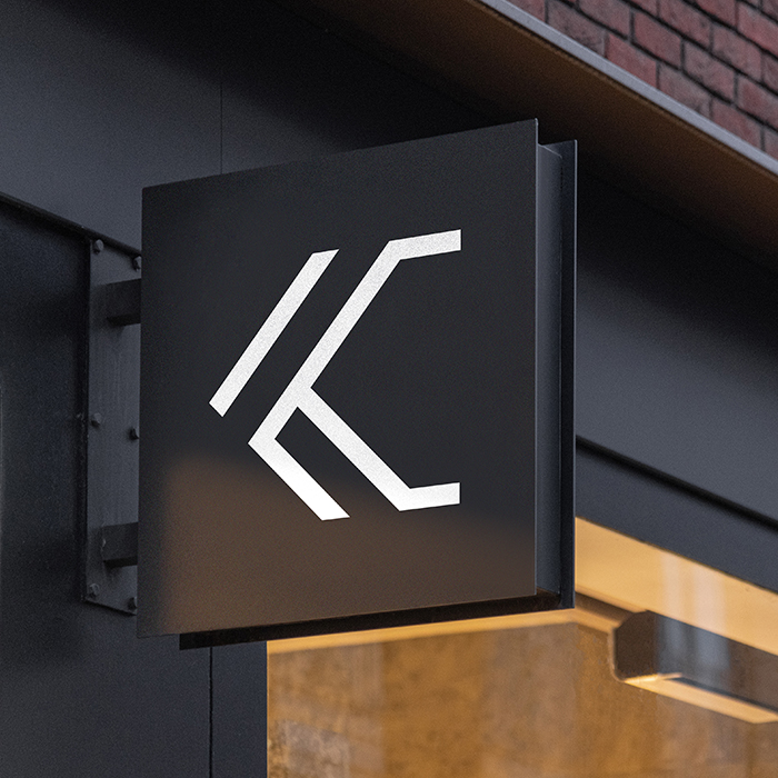
While working on Centurion’s new symbol, I wanted their logo to be such that it could depict the unique story of the brand in a succinct and clear manner. Since Centurion’s work is focused on luxury cars, I took inspiration from a tire thread as it portrayed the business of the brand. Moreover, the symbol had to be such that it could work perfectly as a standalone symbol, without the rest of the wordmark too.
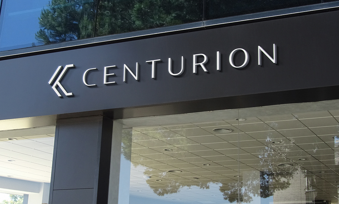
I crafted an abstract “C”, which drew inspiration from the sharp angles of the tire threads. This “C” denoted exceptionality like the service of the brand itself.


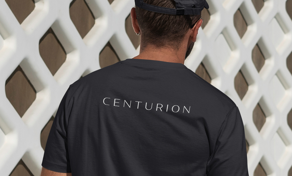
Wordmark Development
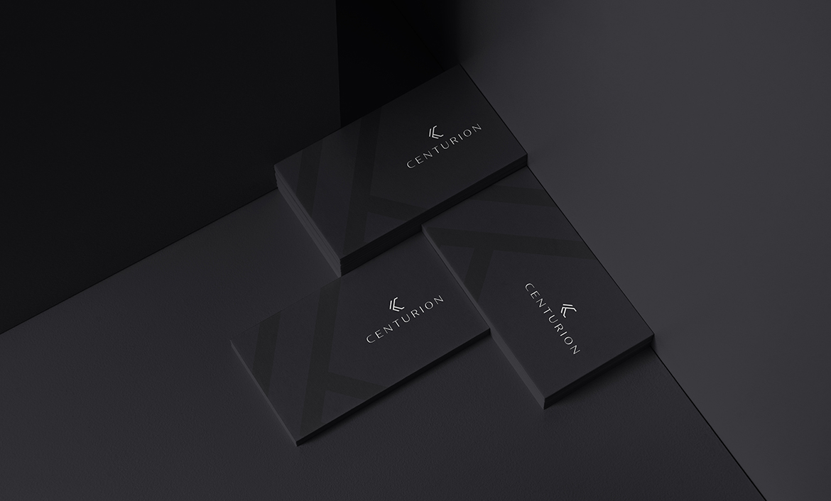
The wordmark I designed is entirely custom so that it not only matches but also continues the elegance of the symbol. Moreover, I laid special emphasis on whether or not the wordmark sat well with the symbol and had a direct connection with it. Adhering to the premium aura of the brand, it is essential that the wordmark meets the benchmark and conveys the remarkability of its services.
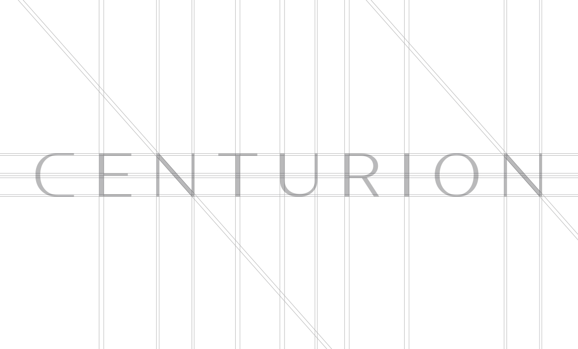
Typography
When I was exploring different fonts for the typographic system, I had the mind of settling with a font that created the perfect balance between stability and personality. This I achieved by selecting GT Super Display as the primary font and Maison Neue Extended as the secondary font.

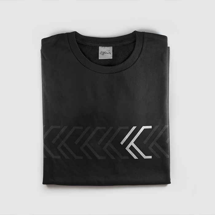
Pattern System
With the symbol finalized, I could move forward on developing a pattern system that could play well in structuring the brand on different platforms. In lieu of the symbol, I came up with an adaptable pattern system, inspired by the tire threads. Not only would this pattern system help in cementing the brand’s new identity, but would be easily implemented on all sorts of brand applications.
Love what you see?
Let's talk