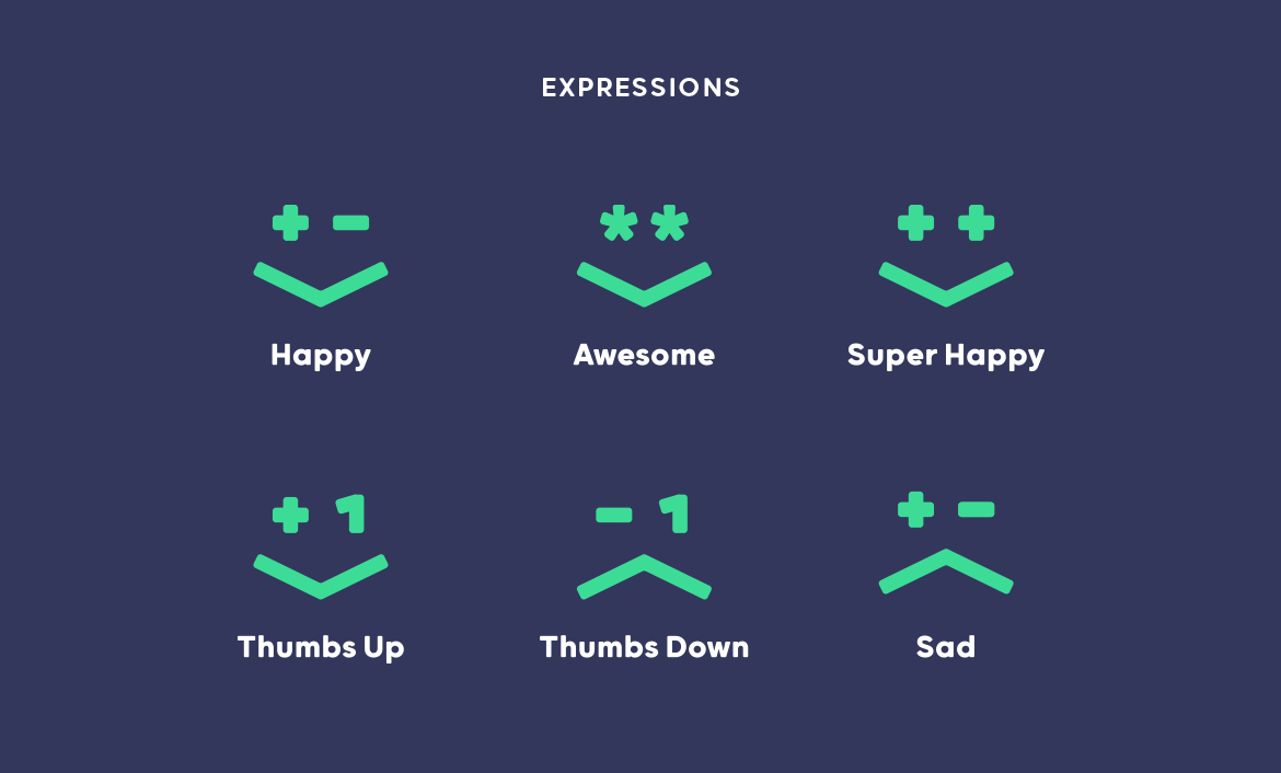
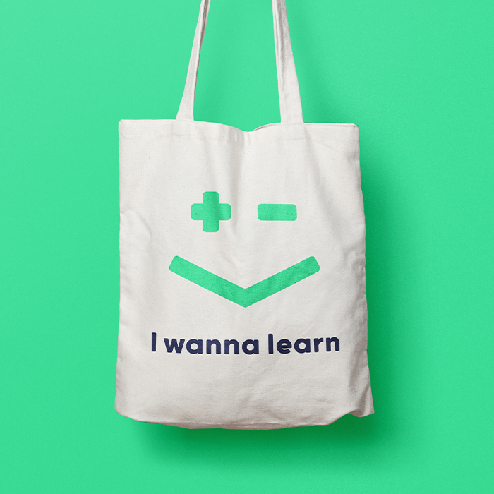
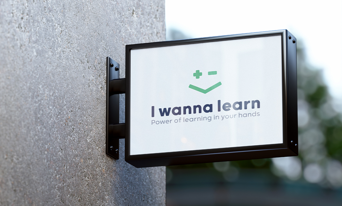
From the inception, we discussed I wanna learn on a broader level, as a company, not just a platform. As such, we went over its values, what it offers, the aspects and emotions that form the core of the brand and other points. We wanted to make sure that the logo reflected the educational vision of I wanna learn, in addition to imparting happiness and friendliness, hence giving it a human touch. In this lieu, I ensured that whatever ideas I brainstormed consisted of some sort of Mathematics symbols so users could instantly understand the platform’s industry.
I WANNA LEARN
In 2020, the creators of Altius Foundation approached me for the purpose of branding one of their products. These creators were also associated with Breadcrumb, another brand I had worked for. The creators decided that I wanna learn should be exhibited with a logo that was comprehensible and hence easy to understand, while reflecting the brand’s educational vision.
Currently, I wanna learn is doing very well and has managed to be implemented in around 60 schools in India.
- client I WANNA LEARN
- year 2020
- disciplines Art Direction, Branding
research & planning
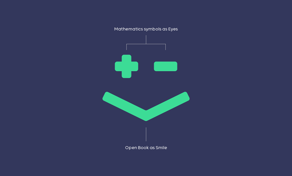
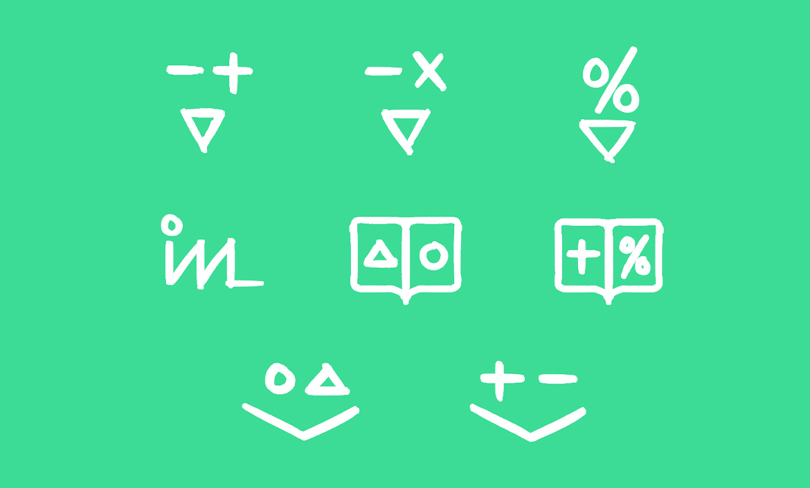
After going over a few ideas, I came up with the solution that the ‘mathematics symbols’ and a ‘book’ as a smile would be best suited for the logo.

Colour Palette
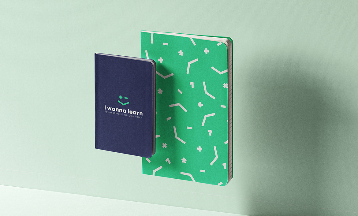
While working on the logo, I experimented with a diverse range of colors, with a prime focus on soft shades. Eventually, green stood out as the main brand color and a clear favorite among me and the platform’s creators.

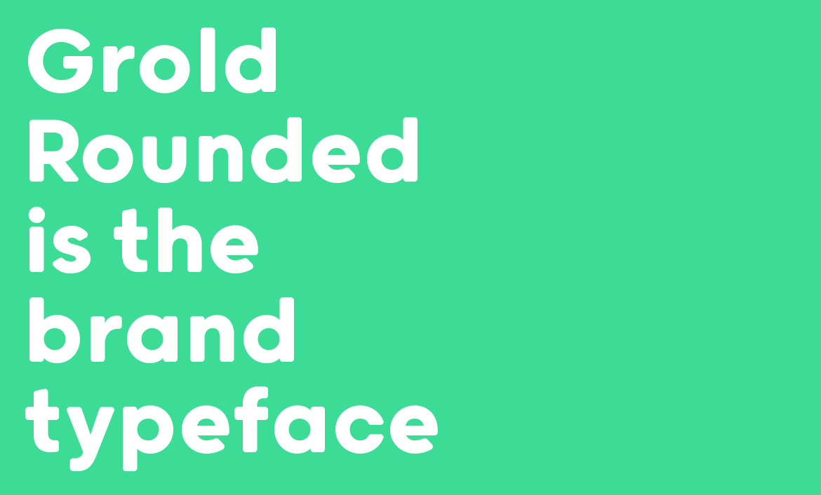
Brand Typeface
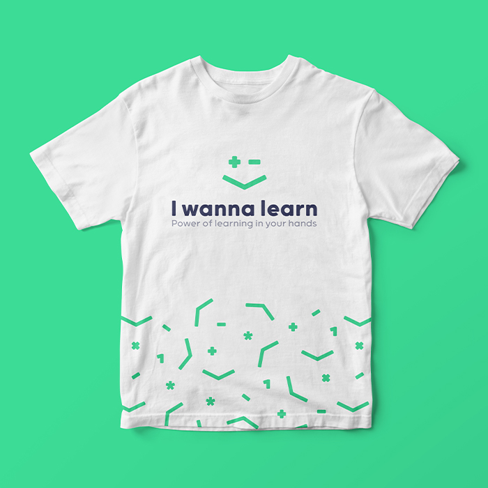
Grold Rounded provides a cheerful, soft and happy look while its clean structure means it's not too loud and still fits with the other elements. On the other hand, Grold is more suited to type-setting, as well as tagline.


Love what you see?
Let's talk