A baking business caters a diverse range of customers and with that in mind, I envisioned a logo that truly embodies the distinctiveness of their exquisite cakes. To make the identity attractive, I planned to add a splash of colors to make it look like an ideal choice for all ages and genders.
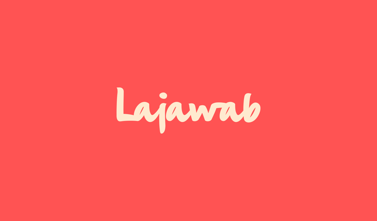
LAJAWAB
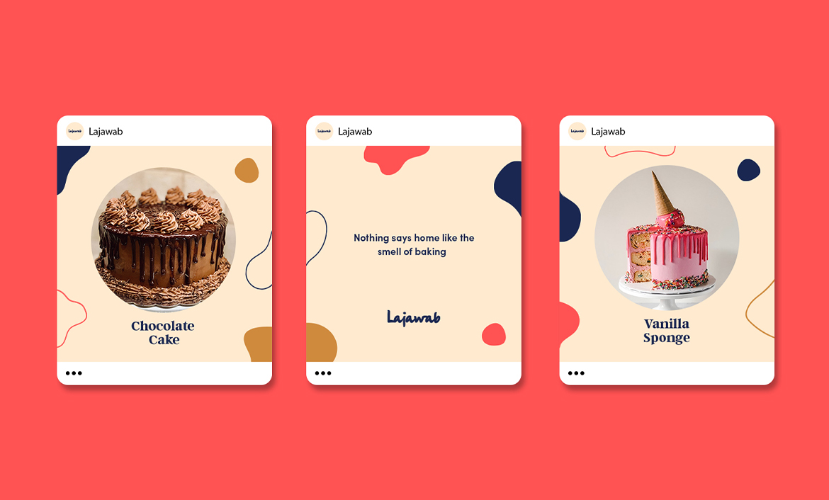
Lajawab is a small, home-based patisserie in Karachi, Pakistan, specialized in crafting unique, and delectable cakes for special occasions.
In 2020, they approached me with the idea of showcasing their brilliance out to the world, so I provided their business with this identity now known as ‘Lajawab’. I merged cheerful colors with their brand’s unique aura to help them confidently stand out of the ordinary.
The name ‘Lajawab’ is literally derived from Urdu, means ‘Priceless’. I aimed to provide them with a remarkable and lasting identity beyond just branding.
- client LAJAWAB
- year 2021
- disciplines Name, Brand Identity & Packaging
research & planning
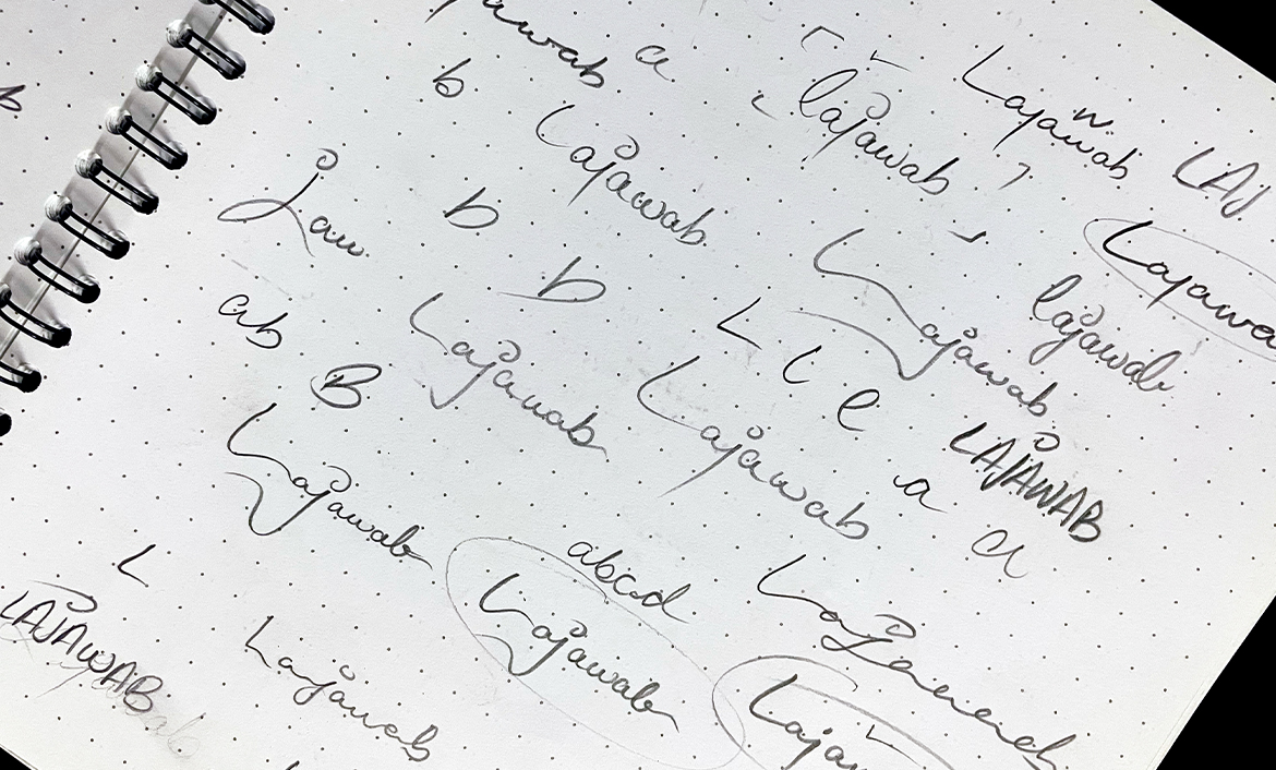
LOGOTYPE DEVELOPMENT
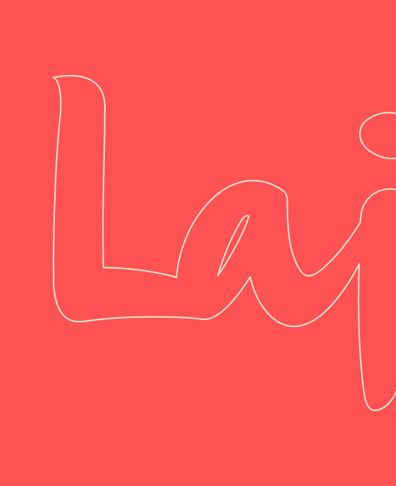
While exploring, I commenced to draft a few rudimentary outlines of the flair I wanted to create as I conceptualized the overall aesthetic of the wordmark. I went on further to analyze different variations to determine one perfect impression and hence, the wordmark logo of ‘Lajawab’ came into existence.
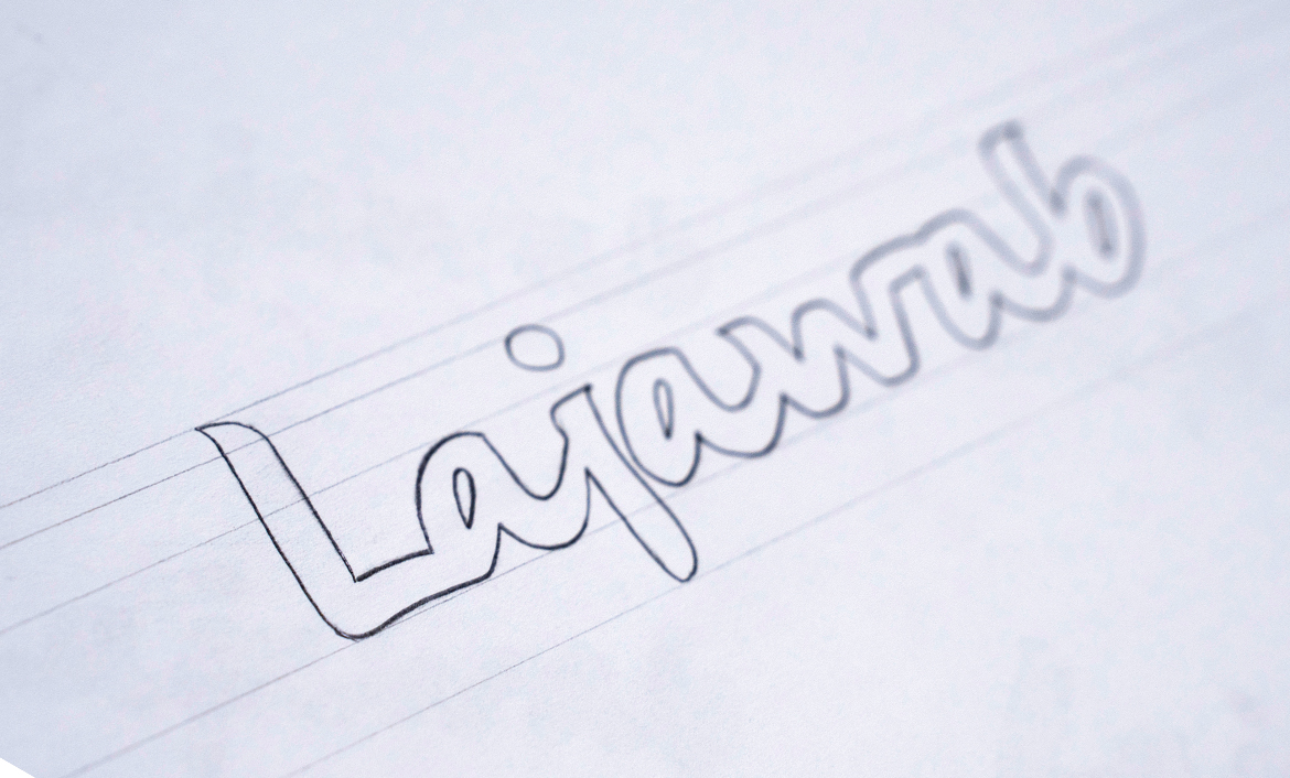
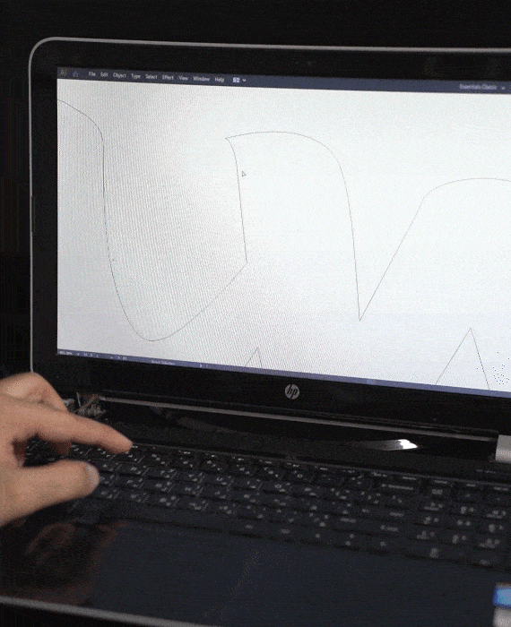
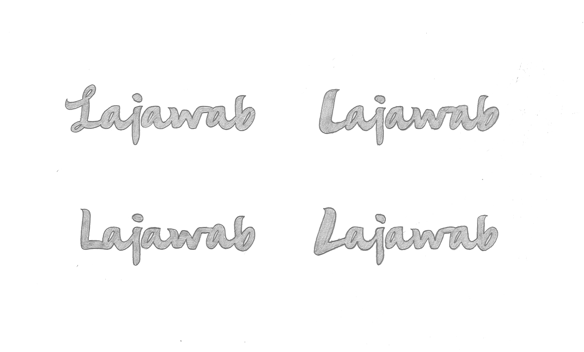
FINALISING
Before arriving to conclusion, I had a detailed outlook of how pristine I wanted the wordmark to be while adjoining the letters and assessed that a straightforward logo following a representation of patterns were an ideal structure which aligned suitably with the brand.
COLOR EXPLORATION
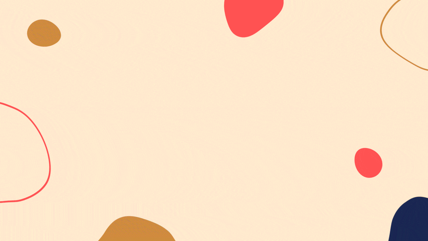
My goal was to find the perfect hue for the logo and packaging design. Berry Blue and Ivory White were chosen for their grandeur and reliability, while Coral Red and Butterscotch were selected as secondary choices for the packaging patterns, representing opulence and liveliness. Combined, they created a stunning brand representation.

Presently the brand is performing admirably in the market and garnering recognition.
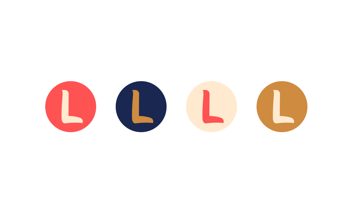
ICON ADAPTATION
To make the icon comprehensible, I encircled the self-standing 'L' with vivid hues to serve as the representation of the social media and web page favicon.
TYPOGRAPHY
Argent CF is characterised by its elegant curves and refined details. Sofia Pro is known for its versatility as it provides a modern and minimalist look.
In combination, they created a balanced and contemporary design of Lajawab which conveys a sense of professionalism, sophistication, and elegance..

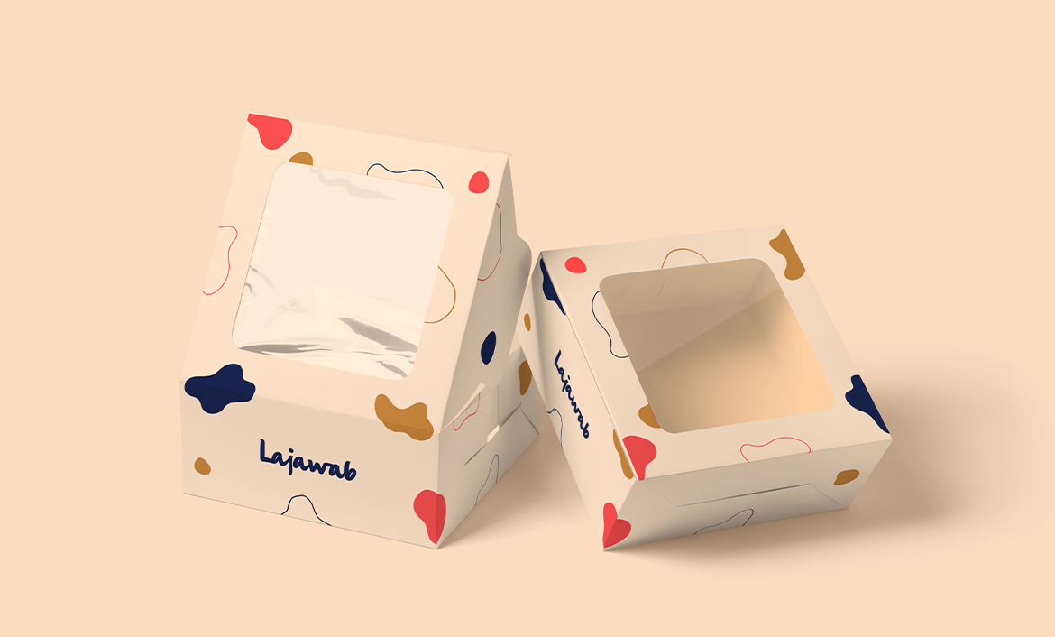
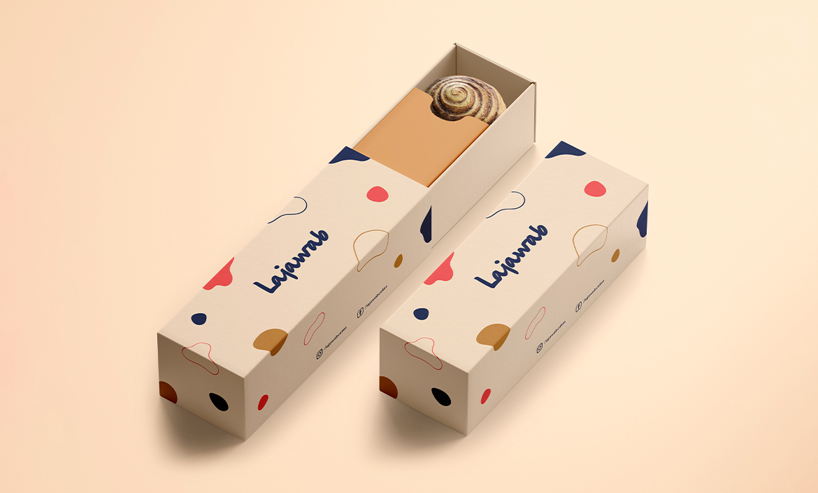
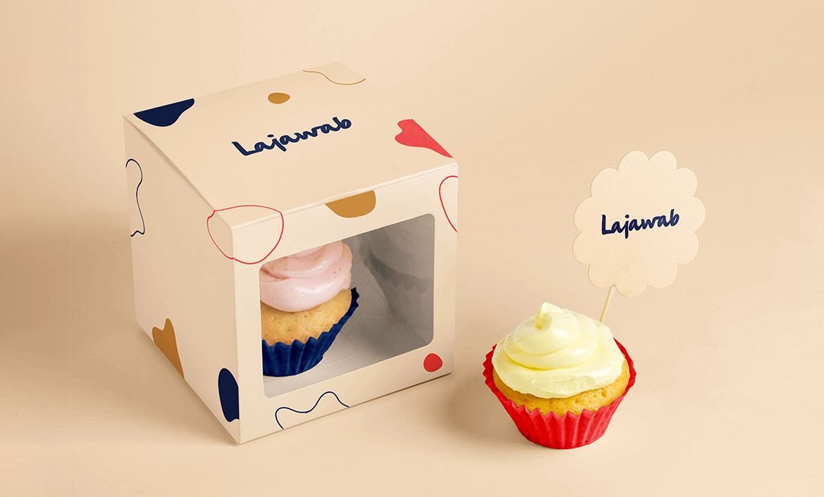
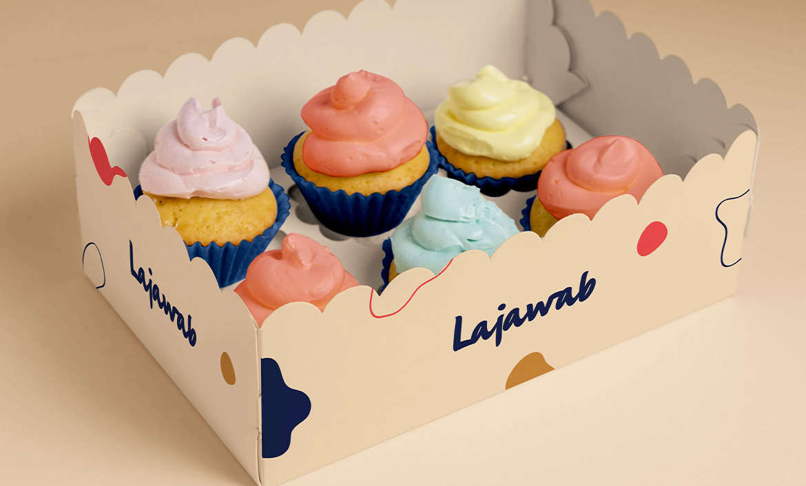
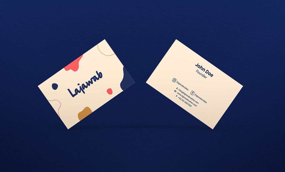
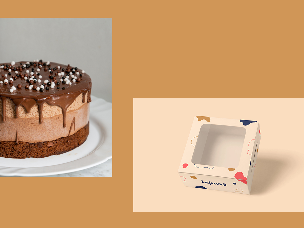
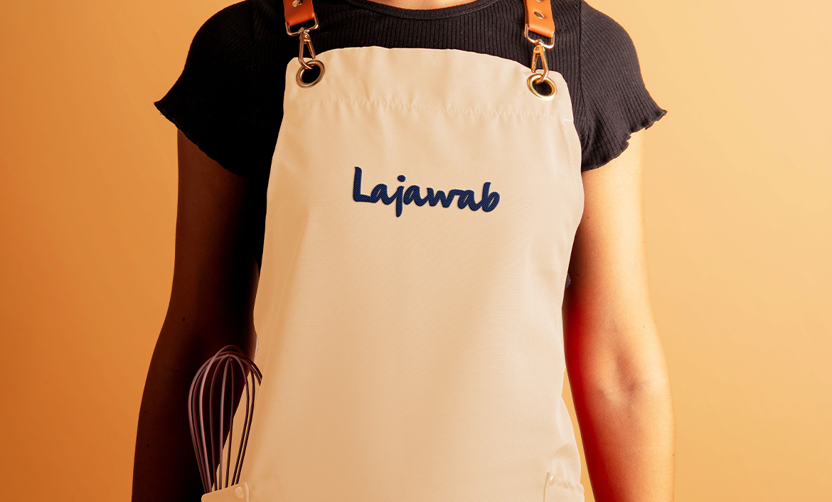
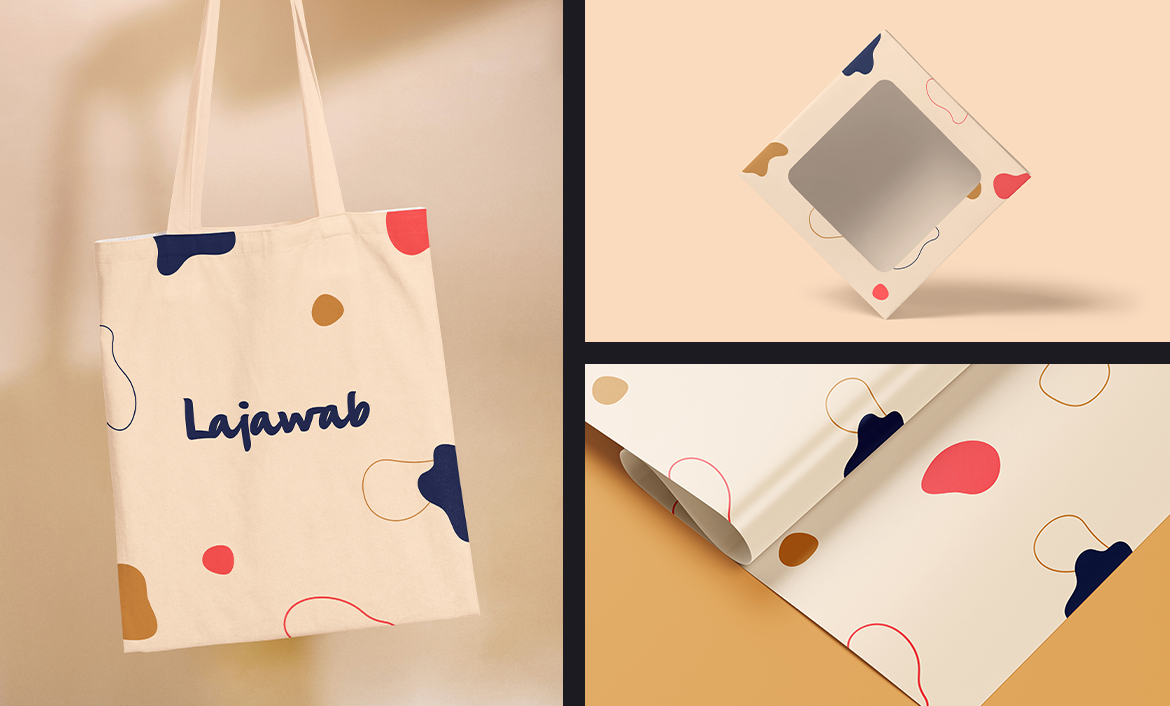
BRAND APPLICATIONS
To finalize it, I attempted to exhibit the brand applied to all mediums to determine if the amalgamation of captivating colors perfectly encapsulated the essence of the brand and it truly turned out to form a remarkable and exuberant concept.

Love what you see?
Let's talk