NOURA

Based in Johannesburg, South Africa, Noura is geared towards the female populace, specializing in womenswear such as abayas, hijabs and burkinis.

In collaboration with the company, the brand name ‘Noura’ has been derived from word ‘Noor’, which is Arabic for ‘light’. As such, focus swayed towards elements such as the stars, since stars are always emitting off bright light.

  • client NOURA
  • year 2019
  • disciplines name, branding & packaging

concept development

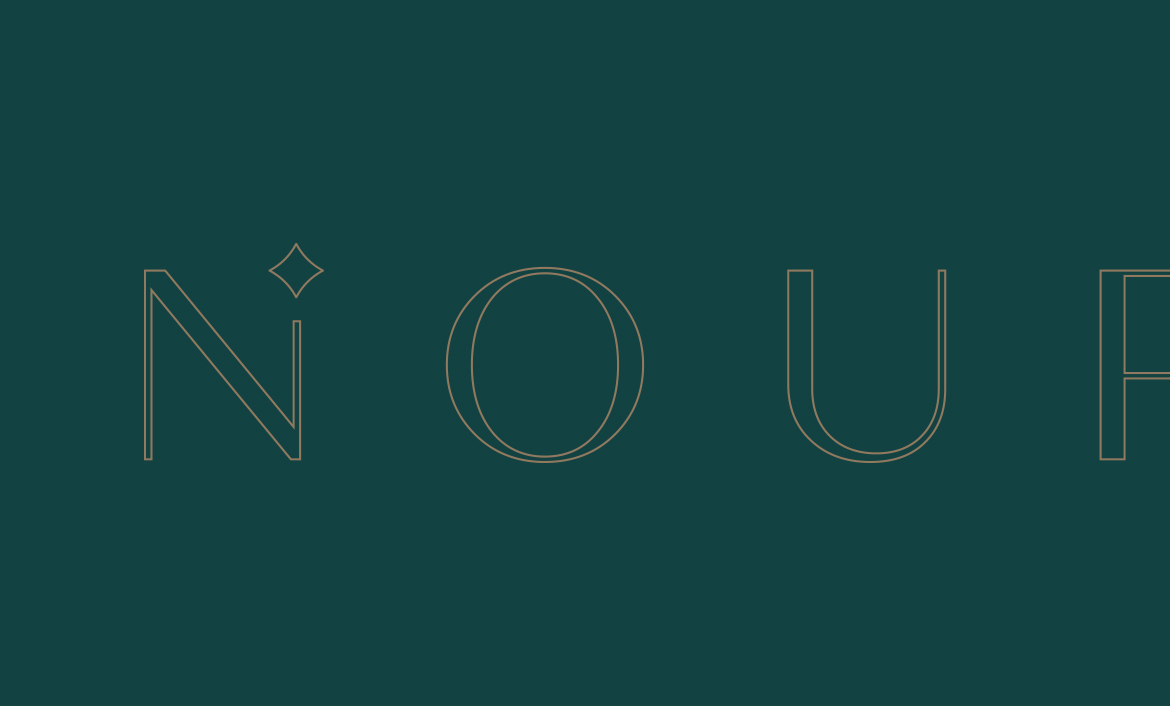
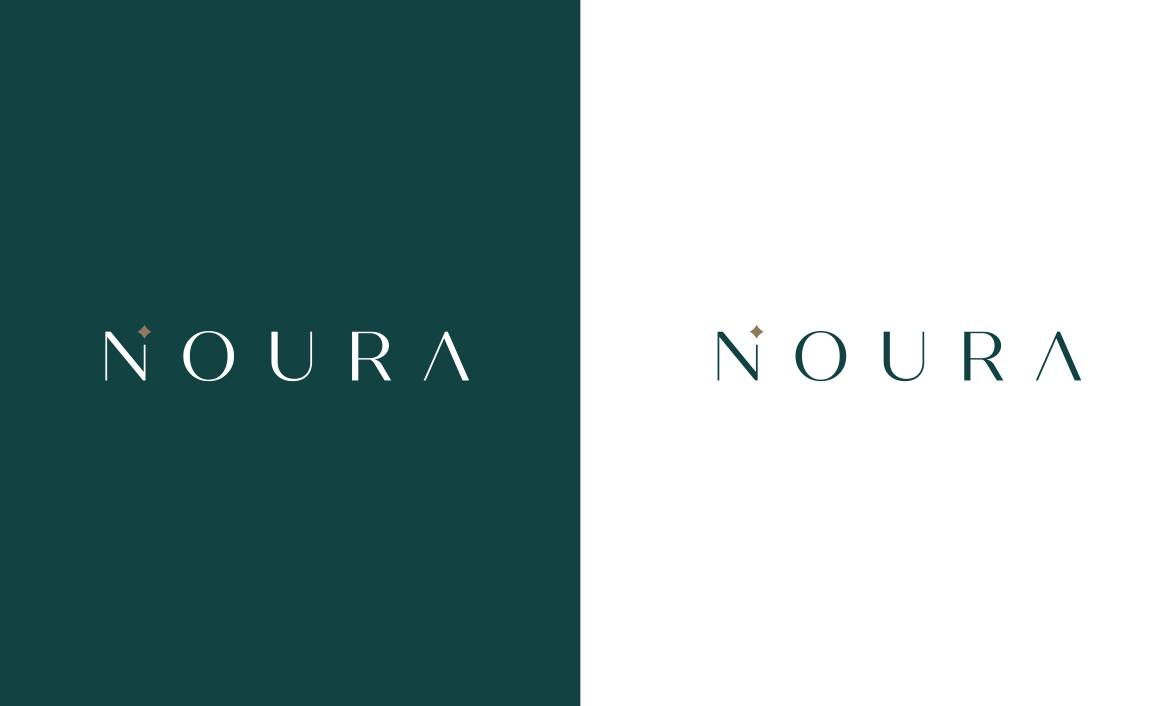
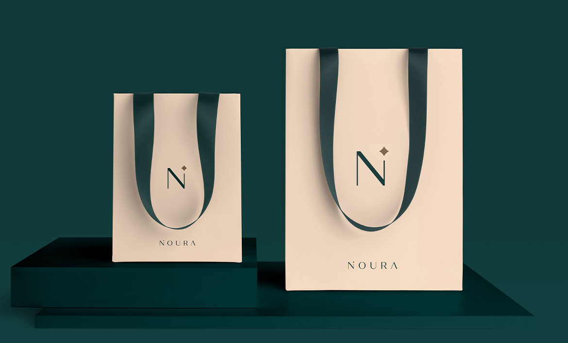
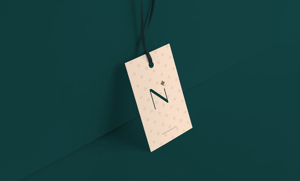
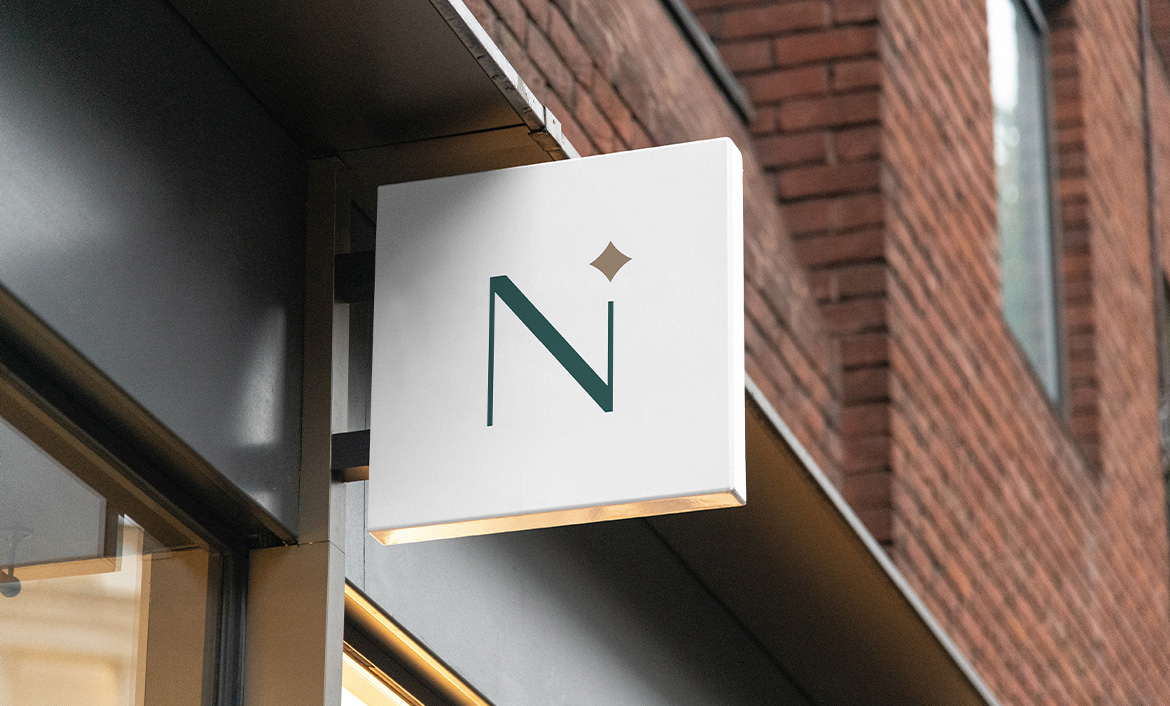
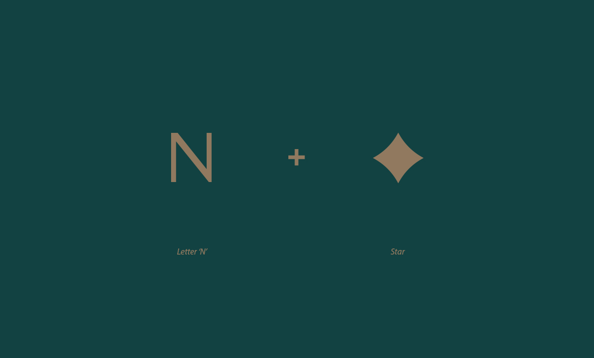
Settling with ‘star’ as my main element, I decided that I would place the small element on the hairline of Noura’s ‘N’. The idea here originates from the fact that stars produce their own light and appear rather small, due to the large distance between them and our planet Earth.

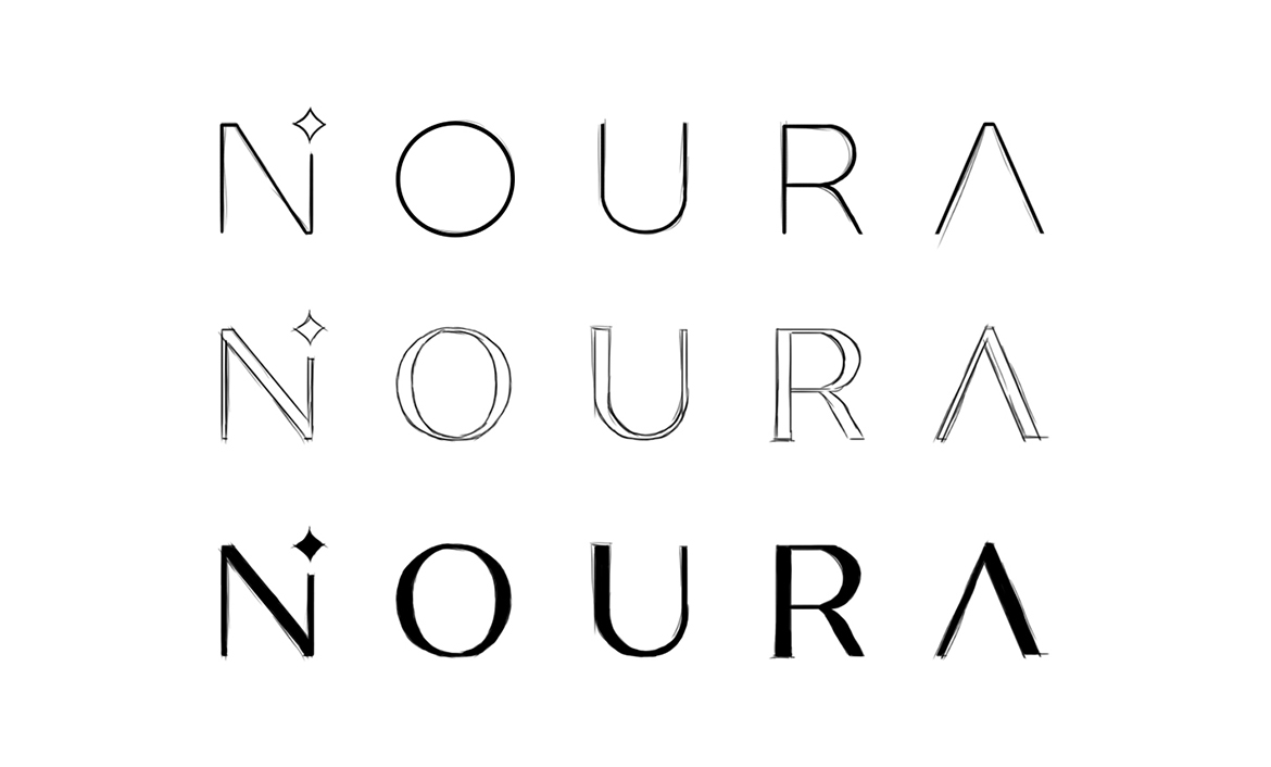
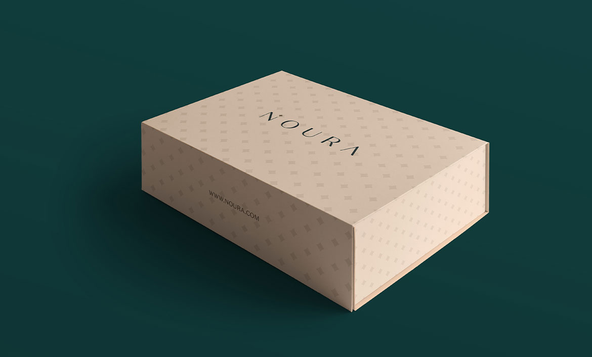
Afterwards, I had to work on the logotype and see the kind of variation that struck the best. Since the brand ought to appeal to a sophisticated segment of the populace, I found it best to work on a slightly bolder version, which I could fill with a high-end colour.

Logotype finalising

While the rest of the logotype was featured in green, the star on ‘N’s’ hairline was chosen to be golden to signify it shining from the above and emitting bright light. The spacing between the logotype’s letters was set in such a manner that is gave a sleek look to the overall logo, hence giving off the brand’s luxury image.

For such high-end luxury brands like Noura, one has to be specific with regards to the spacing, the weight and the fill of the logotype’s font. Each of these characteristics are inadvertently employing a crucial role in making up the appearance of the logotype, thereby influencing the outlook of the overall logo and the brand.

Colour palette

The colour palette of a brand should go in line with the brand’s niche and expertise. After i completed my work on the logotype, I narrowed a set of colours that would match best with the brand. Coming down to three colours, namely emralad green, gold and champagne pink, I applied the brand on different channels and displayed how the brand would appear in actuality.

A major reason for going with green is its significance in the religion of Islam and Islamic culture. The colour symbolizes life and nature, and carries more or less similar connotations in the rest of the world too. Since the brand’s target audience comprises of Arabic or Muslim women, a darker shade of green seemed a greater fit to exude sophistication and a touch of Islamic culture.

Love what you see? Let's talk

next project

LOGOFOLIO

<