For such a business that dealt in luxury menswear, I immediately stumbled upon the idea of going with a monochrome theme. Simultaneously, I had to preserve the premium image of the brand for which I decided that it was best to go with simplicity to give it a sleek look.
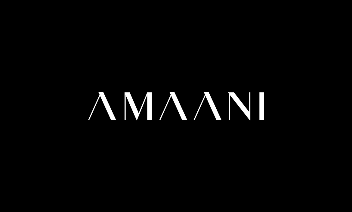
AMAANI
Amaani is a luxury menswear brand based in South Africa, which primarily deals in thobes. They reached out to me for building their brand identity in such a manner that it would appeal to their target audience who prefers high-end thobes with an aura of elegance.
- client AMAANI
- year 2019
- disciplines Naming, Branding & Packaging
research & planning
design & development
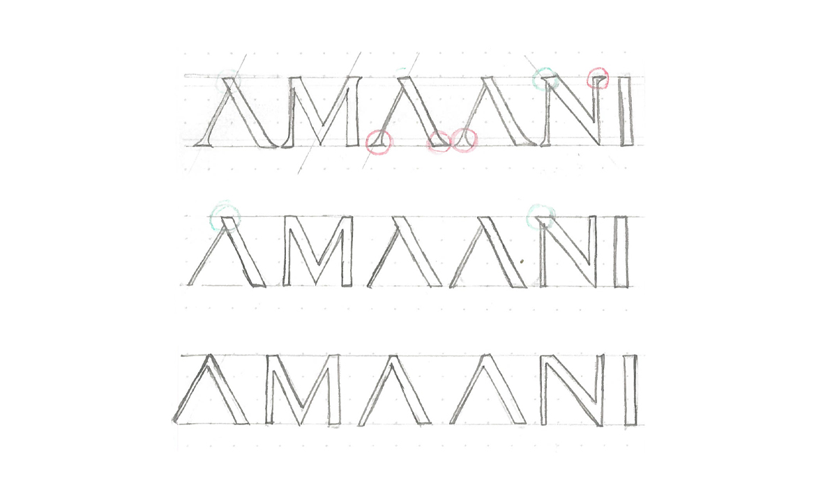
After much research, I settled with a type and decided to customise the type in my own manner, for giving a unique feel to the brand. To do this, I designed three variations by adding as well as removing the Serifs from the font.
However, as per discussion with the client, I selected the logotype that had the subtle serif on the ‘A’ and on the ‘N’. This selection was due to the fact that both the client and I felt that the logotype with the subtle serif exuded more class and simplicity as compared to the other ones.
finalising
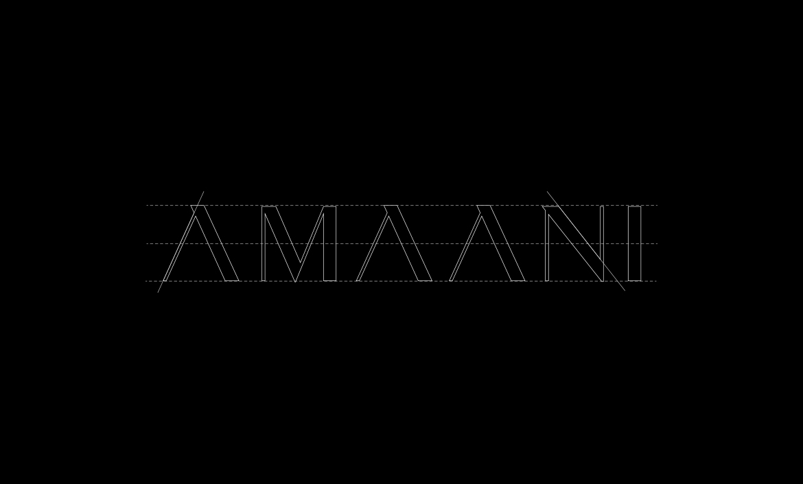
Having finalised the logotype, I inspected the logo closely to ensure that the letters were in an accurate symmetry. The spacing between the letters and the symmetry adds to the aesthetic of the logo and gives it a sophisticated look. Moreover, it helps the logo fit well on all types of mediums.
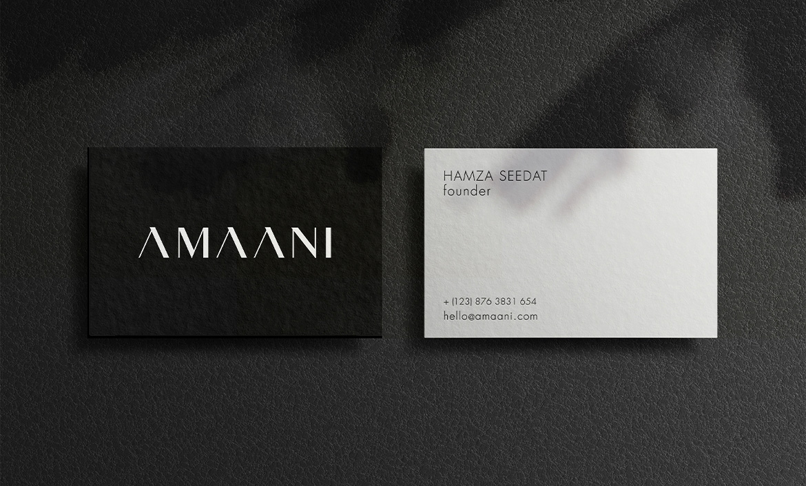
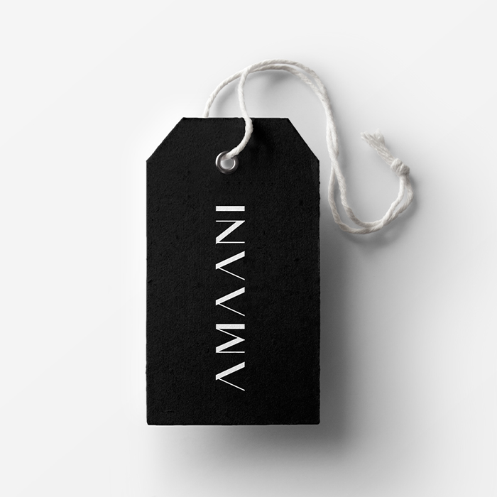
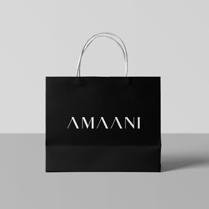
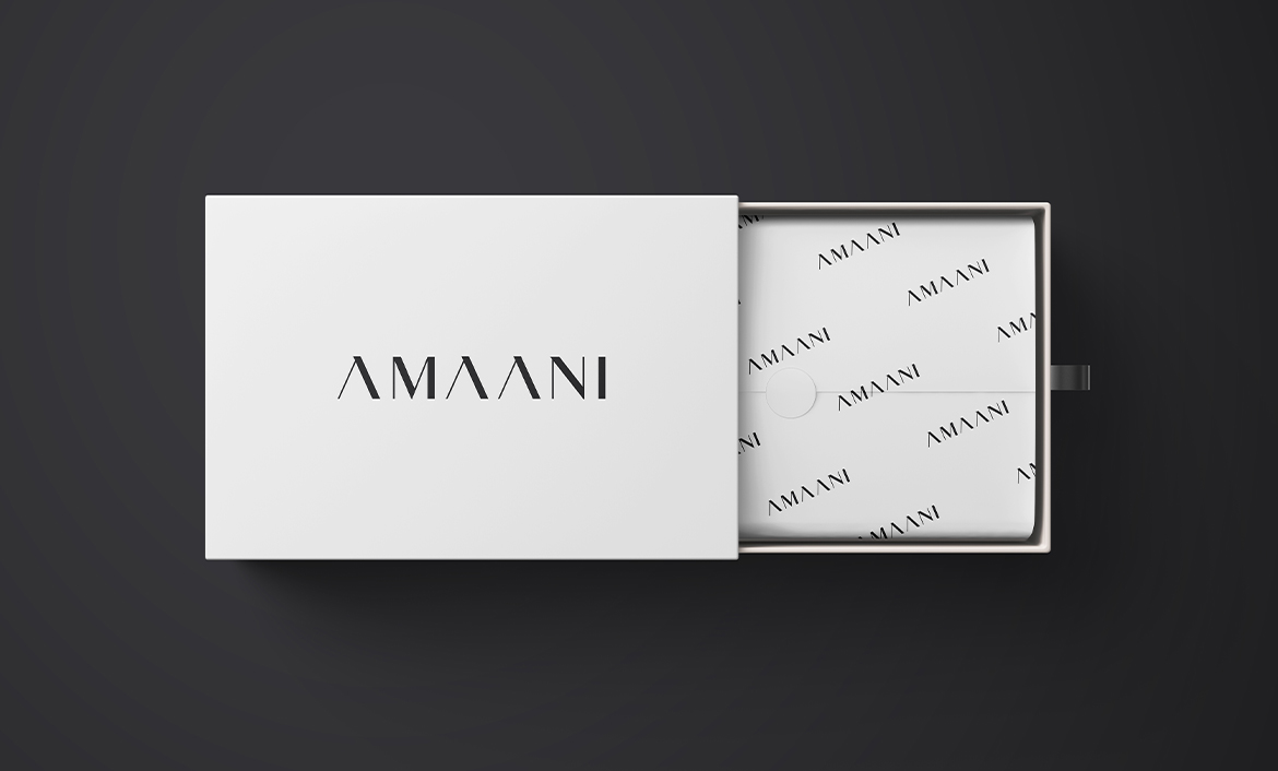
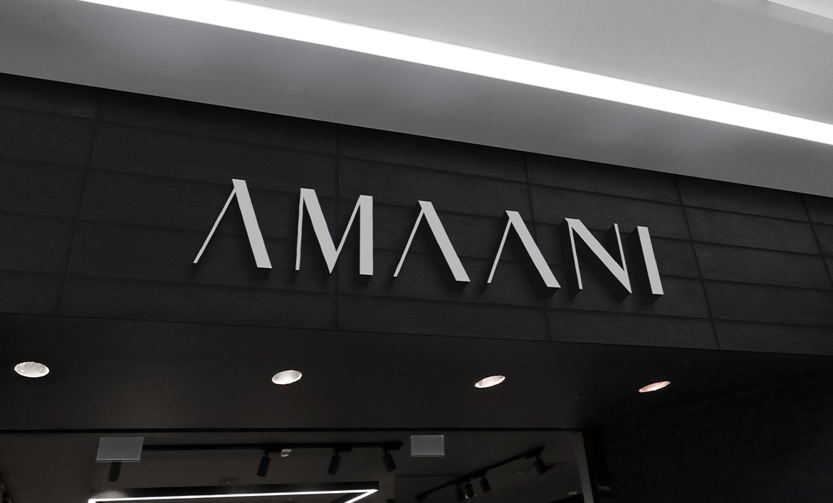
Lastly, it was time to display the brand applied on different mediums, including the company’s price tags, shopping bags and as signage for the brand’s store.
Love what you see?
Let's talk