BREADCRUMB

Breadcrumb is a learning app for children so they can learn and add to their knowledge, through a bunch of activities and libraries. Parents can rest assured that their children will be subject to positive screen time with this interactive app that comprises curated content where activities requiring usage of sharp objects come with an Adult Supervision specification.

  • client BREADCRUMB
  • year 2019
  • disciplines art direction, Branding

research & planning

Since Breadcrumb’s target audience consists of pre-adolescent children, I considered various topics that are normally a part of the curriculum of primary schools. Additionally, I took into account the growth of children as they follow a trail shown to them and learn systematically.

After much research, I settled upon three main factors that related to the niche of the app and the target audience and these included a trail, blocks and the letter ‘b’. Building blocks form an important pastime of most kids while the letter ‘b’ referred to the first letter of the app.

Logotype development

Moving towards the logotype, I had to settle with an option that stroke as neither too dull, neither too whimsical. The brand had to appeal to kids and yet had to give off an aura of sobriety while keeping the playful nature intact.

After selecting my final type, it was time to select the font’s properties as well. Going with all lowercase letters, the niche of the company compelled me to choose the font with a hint of ‘bold’ rather than regular.

However, that is not all. Applying properties to a font is just a mid-of-the-way task, for I tend to set the spacing between the letters to ensure that they do not appear too congested or too far apart. This is essential for making sure that the logo strikes well on all mediums and appears well as a standalone logo type.

Colour Exploration

Children tend to be attracted towards brighter colours and their lighter shades, as opposed to dark colours. Keeping this in mind, I contemplated using four bright colours, which appealed to the eyes instantly. I gave the logo a shape that comprised of all the essential colours.

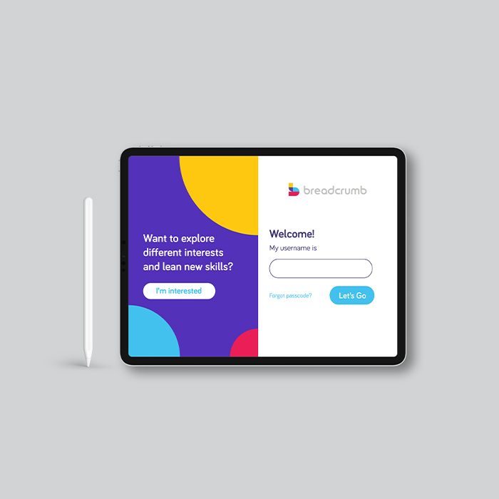
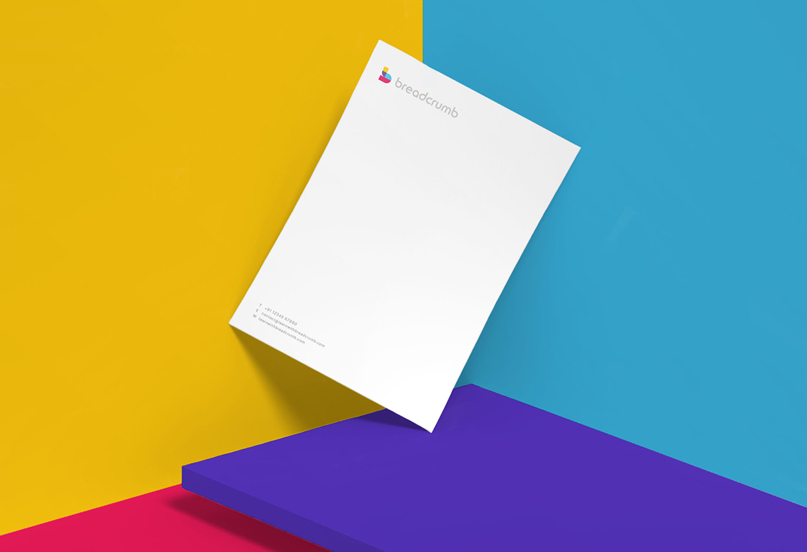
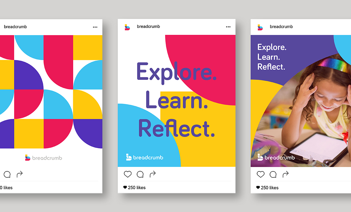
Effendy came with great recommendation and I’m thrilled to recommend him to more people as his work truly stands out. We reached out to him to help build an identity for our app - Breadcrumb (a learning tool for children, available on the iPad). We are across the world, so most of our conversations were chat or call, but he really understood what we were looking for and delivered as promised. If you are looking for a minimalist, clean and unique design for your brand - he is the person you are looking for.


SHARANYA DILIP

CO-FOUNDER, Breadcrumb - The Learning App

Love what you see? Let's talk

next project

GAINEE

<