GAINEE

Engaged in visual content generation using General Adversarial Networks or GANs, Gainee emerged as an amalgamation of the word Genie and the acronym GAN. Aimed at producing unique visual content, the company is associated with making use of AI tools that can help in generating original photorealistic pictures from any kind of input.

  • client GAINEE
  • year 2019
  • disciplines art direction, branding

research & planning

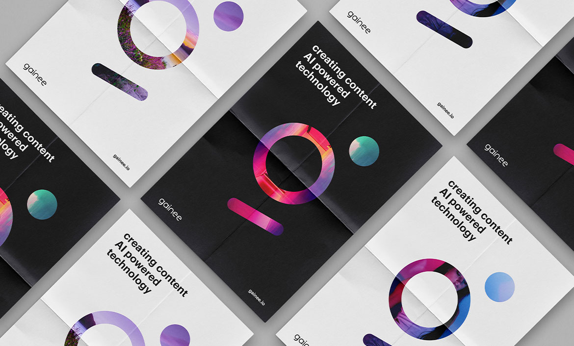
The client provided me with a logo, which he felt that just did not strike as ‘complete’ and required a finishing touch or some customisation, specifically tailored to the company’s niche. As such, the concerned emailed me their requirements and told me about their sentiments and what they desired the logo to be.

Understanding their requirements, I realised that the logo needed some modification with regards to its colour, logo marker and logotype. Concerning the logotype, my focus went towards three essential elements; type, search and generate, which referred to typing the query, its search and the subsequent generated visual. I made sure to balance the logo marker in such a manner that it resembled the ‘G’ of Gainee.

design & development

Having completed the setting of the three elements, I moved on the logotype, which I customised by addition and removal of a few serifs. The technique I utilised in this customisation was such that I geared towards rounding the edges of the letters to give them a more curved symmetry.

By observing the before and after of the logotype, one can decipher the prominent nuances and distinguish between the effects of the logotype’s previous and current version too, which give off an aura of a dynamic brand.

Colour Exploration

Next up, it was time to choose the perfect blend of colours that preserved the brand’s tech-savvy identity while giving it a sleek edge. As per the client’s given examples, the direction I received was to create a gradient of colours from more or less the same spectrum. Upon much research, my mind settled upon a shade of blue and pink.

If one may wonder my choice of these colours, it is because their blend produces such a gradient that immediately appeals as both cheerful and intriguing while maintaining its sobriety and sophistication.

Colour Palette

The colour palette was chosen. Moving towards the presentation, I catered to the client’s demand for making variations of the logo in such a manner that they could settle on different backgrounds. This was done using the same colours from the finalised colour palette.

Love what you see? Let's talk

next project

HR PROPERTIES

<