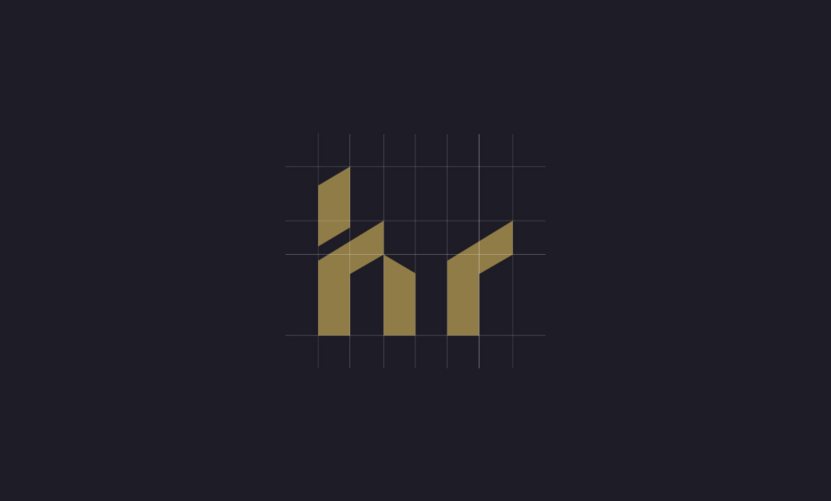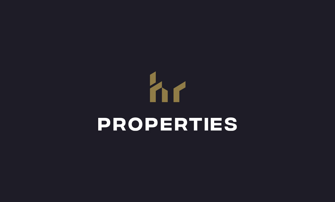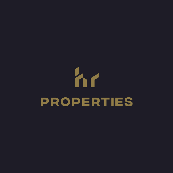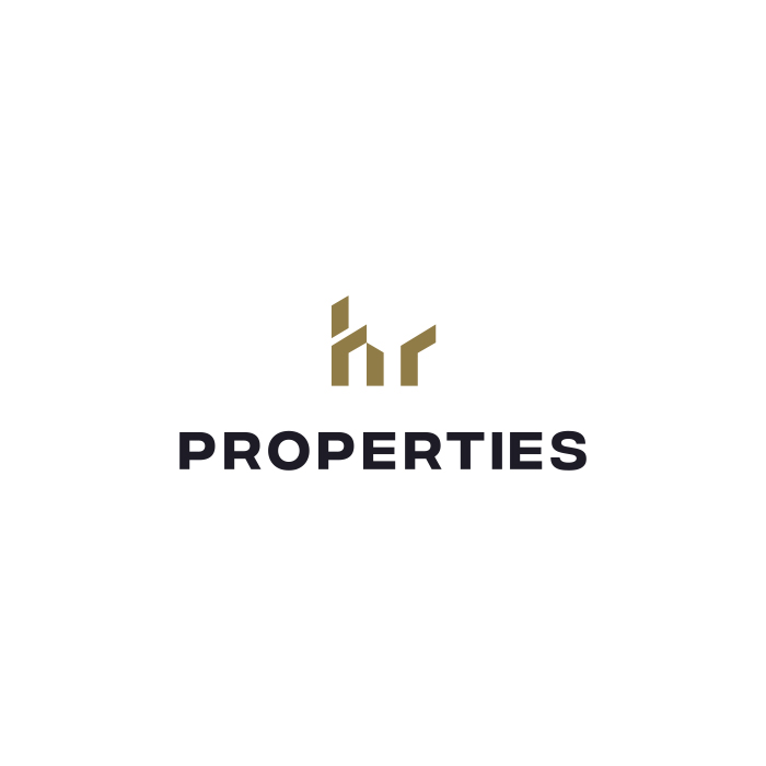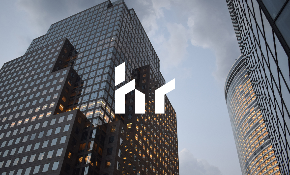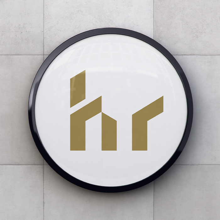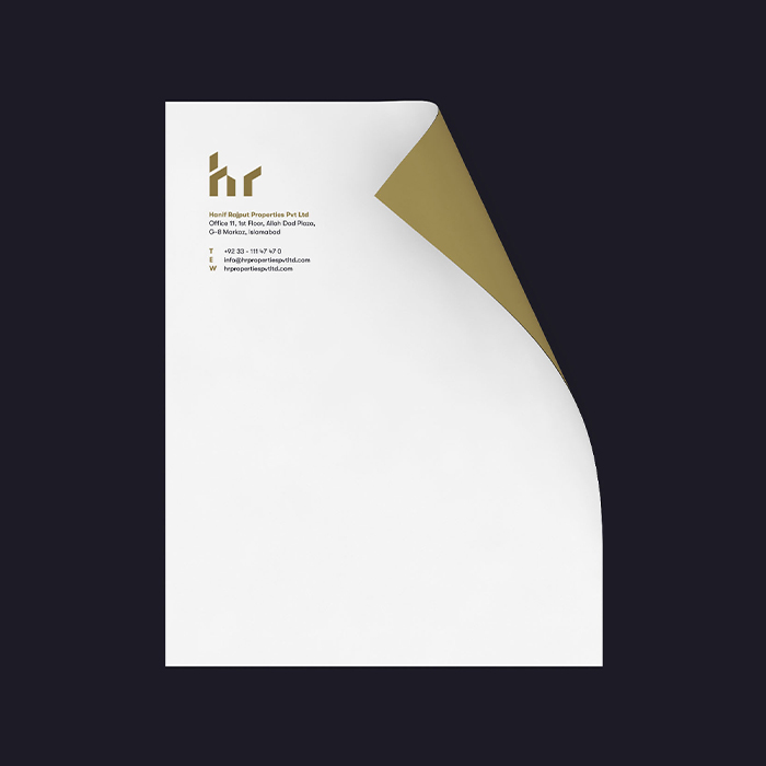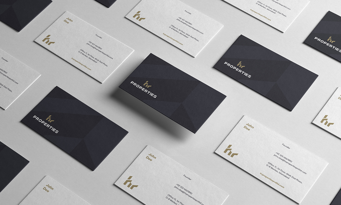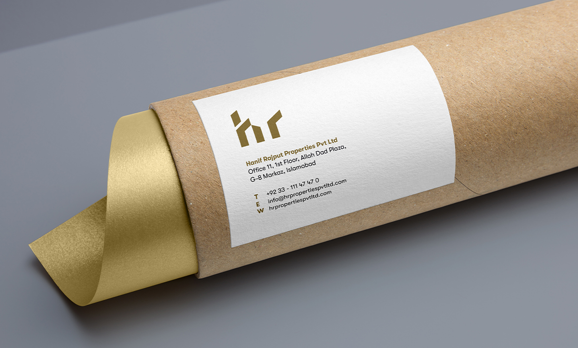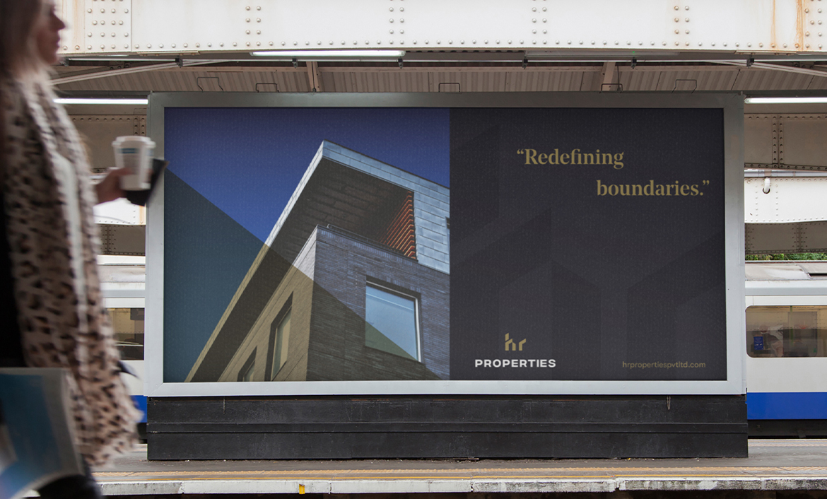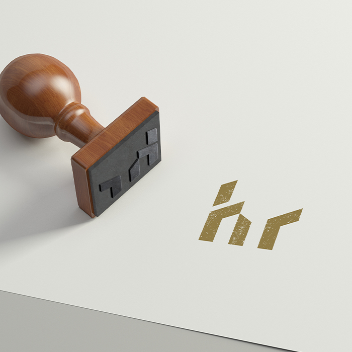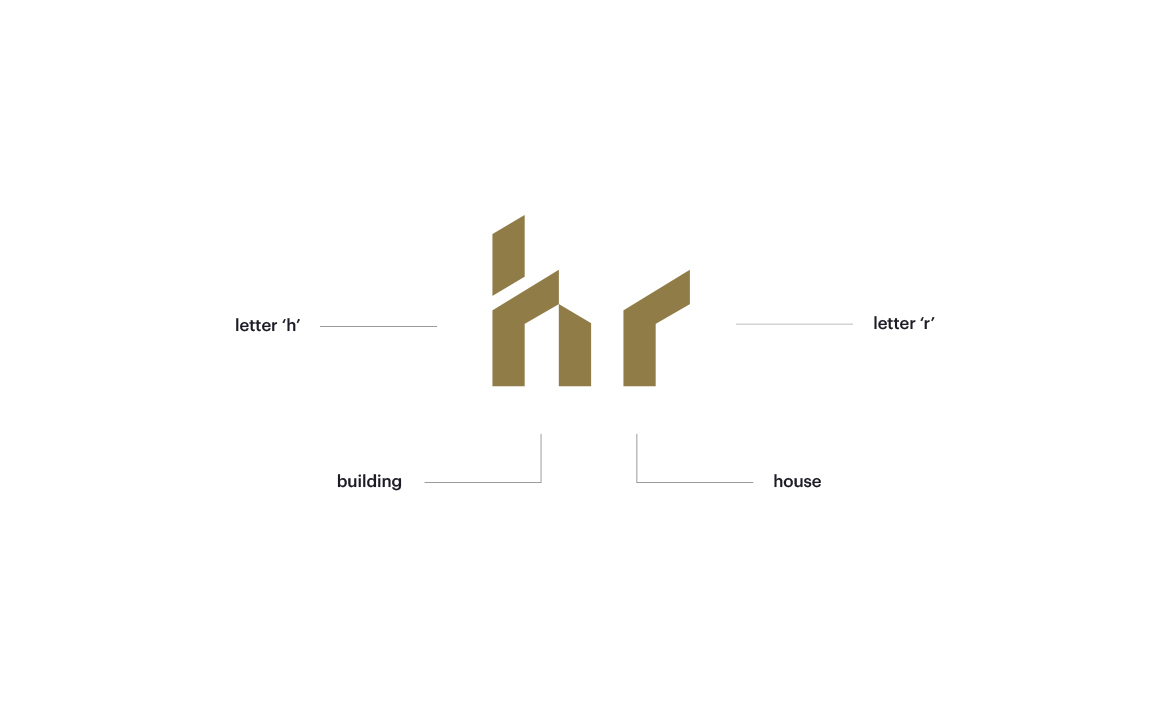
Since the business is focusing on real estate, I researched and visualised for all the elements that could be used in developing the brand. Concerning real estate, one can immediately think about houses and buildings while the business’s initials are H and R. Combining these elements; I came up with the shape of the logo.
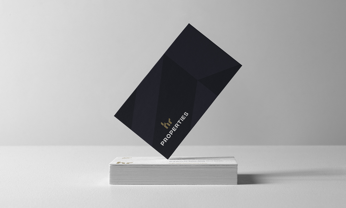
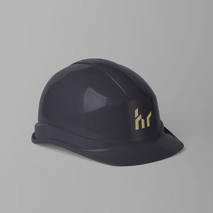
Next, I researched for the colour palate so I could choose the most relevant colours for the brand. Considering that the company has a high-end clientele and their target audience concerns the chic class of the society, I settled with a shade between golden and brown that appeared as premium high-end colours.